Geography and Maps, Graphs, and Charts
Maps, graphs, and charts are amazing ways of using different forms of media to communicate information. People like to see pictures. We all have our favorite memes, right?
I’m not selling https://www.voronoiapp.com/ as anything other than an example of group of people who collecting develop maps, graphs, and charts to communicate information. Whatever your chosen degree field, you will see maps, graphs, and charts to help you understand something about a fact, feature, procedure, protocol important to your field or discipline. You may be charged with developing materials to communicate a message.
I also teach cartography, which the art and science of converting numbers and information and creating a unique graphic called a “map.” Maps can be extremely important tools for helping identify where something is happening. Something else is also going on, though, and I try to remind people about the other side of the equation which is this: If we can see where something interesting is happening then these patterns also reveal where that activity IS NOT HAPPENING. Where things are not happening can be as important of a detail as telling us where a thing a happens.
Mapping Global Happiness Levels is an interesting map. We might be tempted to immediately look for the most happy countries. In fact, the map is colored to make us do this. The human eye is more sensitive to bright colors like yellow and not as sensitive to blues and violets. That is a physiologic fact of how our cones and rods in our human eyes work. Dogs and cats cannot see red (blue and green and yellow, yes); why cat and dog toys are red may have something to do with the chemical properties of red rubber than to make the toy visible to our pets. Red is some hue of brown to a dog.
Color has a physiological impact on our eyes which translate into emotional responses in our brain (also a physiological response). In the map below, the arrangement of graphics on the overall composition is important, too. Africa and Southwest Asia fall directly along our vertical line of sight, centered on the page between the left and right margins. We have to actively move our vision left to engage the Western Hemisphere; not so much so to engage the Eastern Hemisphere. There is also a continental bias to consider since Africa and Eurasia represent the vast majority of the earth’s landmass.
If you are a person with an interest in graphics, the use of shades of the hues is interesting on this graphic. These are precisely bold colors. The colors are not entirely saturated. We have at least 3 font families in use, the typefaces. The typography of the graphic text appears to be well-considered and the layout is well-balanced.
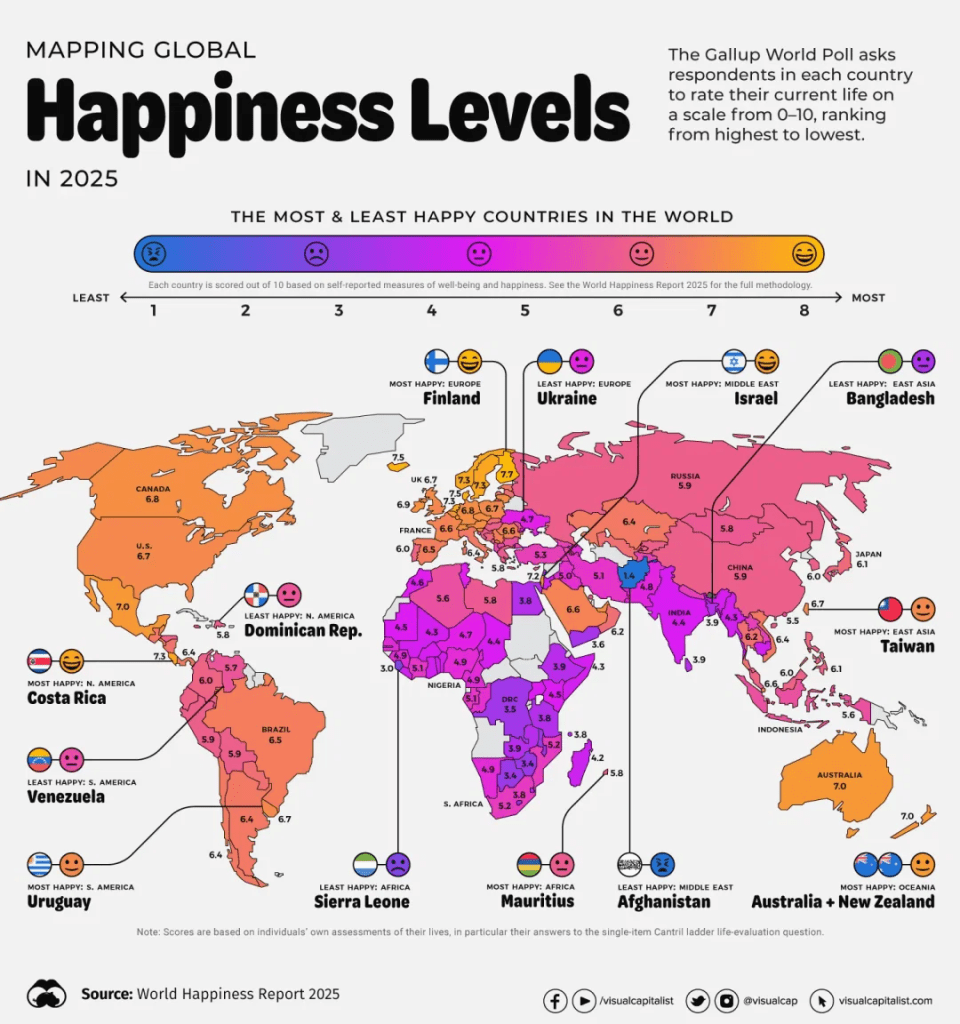
The data values are provided for each country measured with the source provided, so that is nice. Happiness is different than optimist, though. I ran across some media recently (I can’t remember where) which discussed happiness levels vs optimism and the argument was there are significant differences. Happiness is not Optimism. For example, while people in France report being “happy,” they are among the most pessimistic people on the planet. Conversely, where this map indicates citizens of Nigeria appear not to be happy, they are among the most optimistic people on the planet.
I have no data to explain the contrast but I do have my brain which I can use to develop a thought-experiment. What I came up with is this allegory: The people of France represent a high-income nation, an OECD nation. They enjoy high incomes, high levels of technology, a reasonably well-functioning government and a system of social supports which helps support their lives and culture. Thus – and here comes the allegory – they are at or near the mountaintop. They don’t have much higher to climb to reach the zenith. Which is where the pessimism comes from; “We have pretty much reached the top of the mountain. Where do we go from here?” The pessimism represents a societal pause of development to figure out the next step, the next direction. With Nigeria, the people don’t appear to be very happy yet have report the highest optimism (or low pessimism). Imagine standing the base of a mountain you want to climb and you seen the entire trek full of opportunities and adventure. You might not be happy about the work to put in but here is ample opportunity to explore and achieve. That’s my hypothesis. Now, I would need to go gather data to see if I can prove myself wrong.
Yes, wrong. People who don’t understand science believe all science seeks to prove something “right” or “correct.” Nope. Science really works by trying to prove something wrong. Science does not say, “Hey, I want to prove this thing correct.” Science begins by saying, “Hey, I want to see what effect is happening so let’s start off by saying nothing is happening.” In Science, we create a hypothesis like this: “Hypothesis: This drug does not work to cure hair loss.” And then the hypothesis is tested. And then scientists may say, “Yep; this drug sucks at curing hair loss. No significant impact.” This is referred to as “Accepting the Null Hypothesis.” Or, something happens along the line of, “Wait a minute; do we see something happening?” More research is then performed to see what is happening and see if something is significant. Then, we can have a debate about what constitutes “significance.” In physics, especially particle physics, they love significance of 5-Sigma or even better, 6-Sigma. “6-Sigma” refers to a signal or response 6 standard deviations away from the mean value. This is the level of significance used when the Higgs Boson was discovered.
OK; that was quite the SideQuest. If you read this far, thanks for doing the homework!
Here is the link to the map: https://www.voronoiapp.com/maps/Mapping-Global-Happiness-By-Country-in-2025-4434
