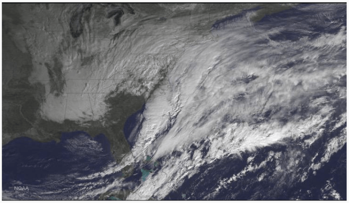
The weather systems which brought rain and some snow to the U.S. Midwest and South threatened to bring record amounts of snow the U.S. Northeast. The NOAA (National Oceanic and Aeronautical Administration) provides daily images, maps, graphs, and reports for global weather systems, not merely those systems affecting the U.S. The image (above) was captured January 26th, 2015 and illustrates what a significant weather system looks like from space. From this image the major part of the weather system appears to have moved off the East Coast of the United States. I’ve noticed from following some social media weather accounts, e.g. National Weather Service (NWS), the estimates for snowfall have been cut almost in half, going from 20-30 inches to 10-20 inches. That is still a fair amount of snow to shovel.
While the full-color satellite images are pretty and carry some information, meteorologists use other forms of satellite imagery for weather analysis.
 This image (left) is a black-and-white image showing simply nothing other than clouds without the Earth’s surface features.
The varying shades of black, grey, and white indicate the depth and extent, or presence, of cloud cover.
Using visible light meteorologists can make an attempt to determine cloud forms. Cloud forms can help us determine what type of weather is arriving and if we might be getting precipitation and maybe some idea of how much precipitation. Thus being able to read the clouds can help us figure out what weather to prepare. Anyone who has watched “World’s Deadliest Catch” has seen evidence of how serious changes in weather can be.
Broad expanses of clouds tend to be stratiform, like those over southern Texas or over Mississippi, Alabama, and Georgia. Changes in intensity can hint at cloud height. For instance, those clouds in Texas might be closer to the ground, while those clouds over Alabama could be more developed and higher in altitude. How can we know?
 The image (left) represents the infrared portion of the electromagnetic spectrum. The sensor on-board the satellite is sensitive to the thermal energy being radiated back into space. The colors represent the lack of heat.
Grey clouds represent warm cloud formations. Yellow cloud formations are slightly less warm (cooler). The blue cloud formations represent the much less warm (coldest) clouds and cloud tops.
You might wonder why I would say “less warm.” Heat is energy; if something is warm that thing contains more energy. If that thing feels cool it could be due to its lack of internal energy. Cool objects are cool due to their lack of molecular energy. So, cold objects feel cold because of their lack of heat. I know that sounds sort of ridiculous, but this course has to frame topics with physics in mind. In physics, we don’t usually talk about things being cold, we talk about their lack of heat, their lack of energy.
In the case of my interpretation, I can see I got the positions of the cloud layers wrong, in fact, reversed. The clouds over south Texas are obviously colder than those over Alabama. The clouds over south Texas are probably stratocirrus, very high, cold clouds. The clouds over Alabama might be stratocumulus, lower and warmer clouds.
These images can come in handy when trying to assess regional precipitation potentials and planning for future weather. For instance, another significant weather system has formed over Alaska. We can see the system is compact with well-developed clouds. The deeper the blue the colder the clouds. The clouds are very high and most likely very thick.
Also, notice the system has a slight eyebrow shape? And, notice the dark arch of clear sky beginning off the coast of California, rising over Idaho, and sinking down over Kansas? This is evidence of a Rossby wave. We will learn about these later. Rossby waves guide and control the movement of global weather systems. By finding and analyzing a Rossby wave we can predict how weather systems will move across a region. Rossby waves are not hard to locate, but you do need a map of the upper atmosphere.
The map at left is from NOAA. NOAA provides many maps for a variety of purposes. This map is from their Aviation Weather Center [link]. Pilots have a very specific need to know about conditions aloft and at various altitudes. A pleasure craft pilot has a different need than commercial pilots. Commercial pilots will direct aircraft through many of the important atmospheric layers. A pleasure craft pilot may information to 12,000ft or so – where much of our poor weather is located.
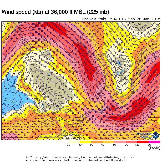 This map illustrates a Rossby wave. The wave is colored in Valentine’s Day colors, reds and pinks, and the wave follows the pattern of a sine wave. Sometimes, Rossby waves can be shallow; other times they can be deep.
This Rossby wave coincides with our current weather system, aka The Blizzard of 2015. The little black “arrows” are station symbols indicating wind speed and direction. The arrows point in the direction the wind is moving, the “feathers” point in the direction of the wind source region. The number of feathers indicate wind speed. Each line is about 10 knots. Half a mark is 5 knots. A thick triangle is 50 knots. Add up the triangles, plus each full mark, plus any half-mark, and wind speed can be determined.
In the red areas, wind speeds are about 125-150 knots (144mph – 172mph). Commercial airlines pilots prefer west-to-east travel as passenger jets can fly more efficiently being carried along in the Jet Stream. East-to-west travel is not as efficient as the aircraft must deal with headwinds. Think of the last time you took a road trip. Much easy to drive “with the wind” than “against the wind.” Boating can have the same effect when piloting “with the current” versus “piloting against the current.”
By examining the position and characteristics of the Rossby waves meteorologist can track and predict how storm systems move. Earlier, I drew our attention to a storm system over Alaska. When we superimpose this information with the information presented on upper air maps we can predict the Alaska storm system will track down over the U.S. Midwest and then proceed over the U.S. Northeast. We also need to remember this storm system will interact with other weather systems, affect and be affected by other air masses, and so conditions may change.
Our atmosphere is not static. But, we have some wonderful tools to help track our weather.
PAX
