One of the over-arching themes of weather and climate surrounds “when” weather happens. “When” means morning, afternoon, evening. “When” also means the season, referred to at times as “seasonality.”
The United States, east of the Rocky Mountains, has been in “tornado season” since March. Tornadoes can occur year-round in the United States but they become much more prevalent in the spring and have increased frequency in the fall.
Because of an unfortunate convention of naming cultural events, we tend to think “summer” begins after schools dismiss. Technically, we are still in spring, and will continue to be in the “spring” season until the 3rd week of June.
Noting our season may seem odd, however as you work through our textbook and the homework, many topics refer to the season or time of year during which specific weather events occur. Pay attention to these questions and think about the time of year which weather events happen. In other words, May is not summertime 🙂 And, most of June isn’t either, right?
Let’s look at some imagery. From Unisys Weather, I pulled this image illustrating emitted infra-red energy. Clouds are generally cool, and become cooler the higher in altitude they become. Very white clouds are very cool, grey clouds not so much, and the warmer surface of the Earth appears as dark grey or very dark grey.
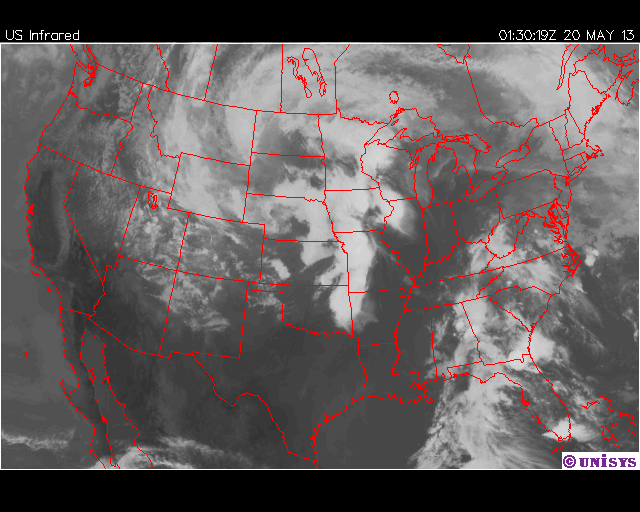
In the satellite image, we can see a band of very white clouds running from eastern Oklahoma northeast across Missouri and into Nebraska and Iowa. We can see colder air curling down from Canada over the Canadian provinces of Alberta, Saskatchewan, and Manitoba, wrapping down into Montana and Wyoming.
Over the Mississippi River and regions to the east, we can see clear air. To the west of the Mississippi, we have rising air; to the east we have descending air. West of the river we have cooler air masses moving south and rising; to the east we have warmer, moister air masses moving north and descending. A recipe for very active weather systems.
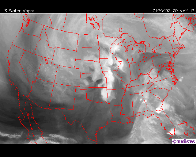
Above, I have include a water vapor image. Basically, the image shows water vapor in the atmosphere. The “whiter” areas indicator greater amounts of water vapor, and rising air. The lighter grey areas and dark blotches indicate lesser amounts of water vapor and descending air. We can infer rising or dropping air pressures from the imagery. The dark blotches indicate descending air. Descending air translates as rising pressure, as the air “pushes” down on barometric sensors. Ascending air, as seen in the white blobs above, translates as dropping pressure, as less force is being exerted on the barometric sensors.
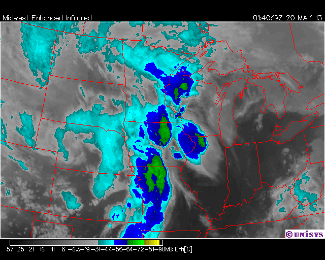
The third image is essentially a water vapor image with heat (temperature) enhancement. Weather satellites are equipped to measure heat, or the lack thereof. A temperature scale, in Celsius, is found at the bottom of the image. Celsius units are the preferred units for the scientific community. Temperatures range from positive units on the far left to negative temperatures on the far right. The “blues” and “greens” indicate temperatures of minus (-)56C to near (-)80C. These temperatures represent very cold temperatures which translates as very high cloud tops and very well-developed, very strong storms with lots of uplift.
Finally, I include an upper air chart which includes heights (in meters) and temperatures (in Celsius). White lines connect points of equal pressure; in the case of this map, the 500mb pressure level. At each of those lines, we find a barometric pressure of 500mb. Usually, the 500mb pressure is found about 18,000ft over our heads. As we move towards the North Pole, air cools, cool air is more dense, denser air settles, thus we find the 500mb pressure level closer to the surface the further north we travel. This map bears out that trend.

Each of the “flags” represent a weather station. If you imagine the flag is “dart,” then the dart’s flight is from the direction of air movement. We can gauge direction based on the dart’s flight, and we can gauge the dart’s speed by the number of bars on the dart’s shaft. Half-a-bar is about 5mph, a whole bar is about 10mph, a little triangle is 50mph. In the map above, we can see some very fast moving winds aloft, moving over the Southwest United States, pulling cold Canadian air down the West Coast, and like a roller-coaster, sending this cold, dry air crashing into warm, moist air moving up from the Gulf of Mexico. I have not looked at the 300mb pressure level but I suspect we are seeing a manifestation of a Rossby wave.
As of this writing, 26 tornadoes have touched down today.
